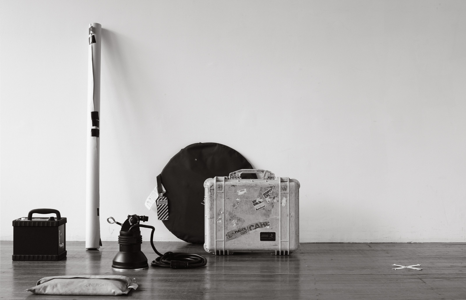
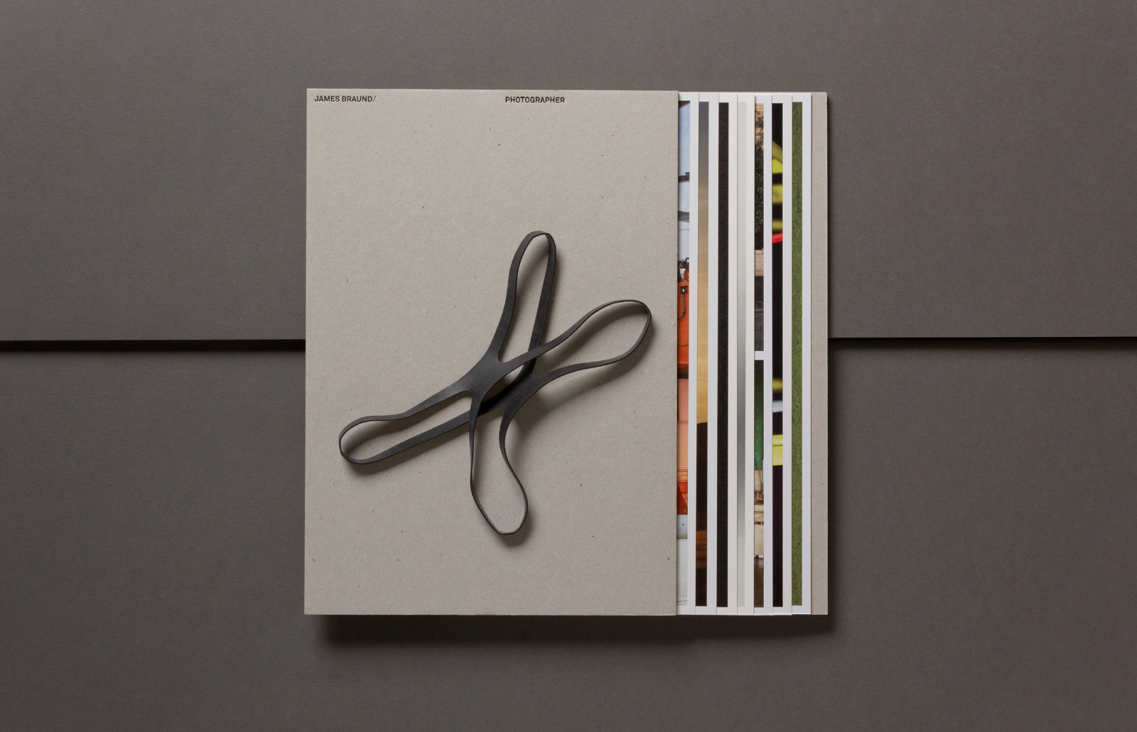
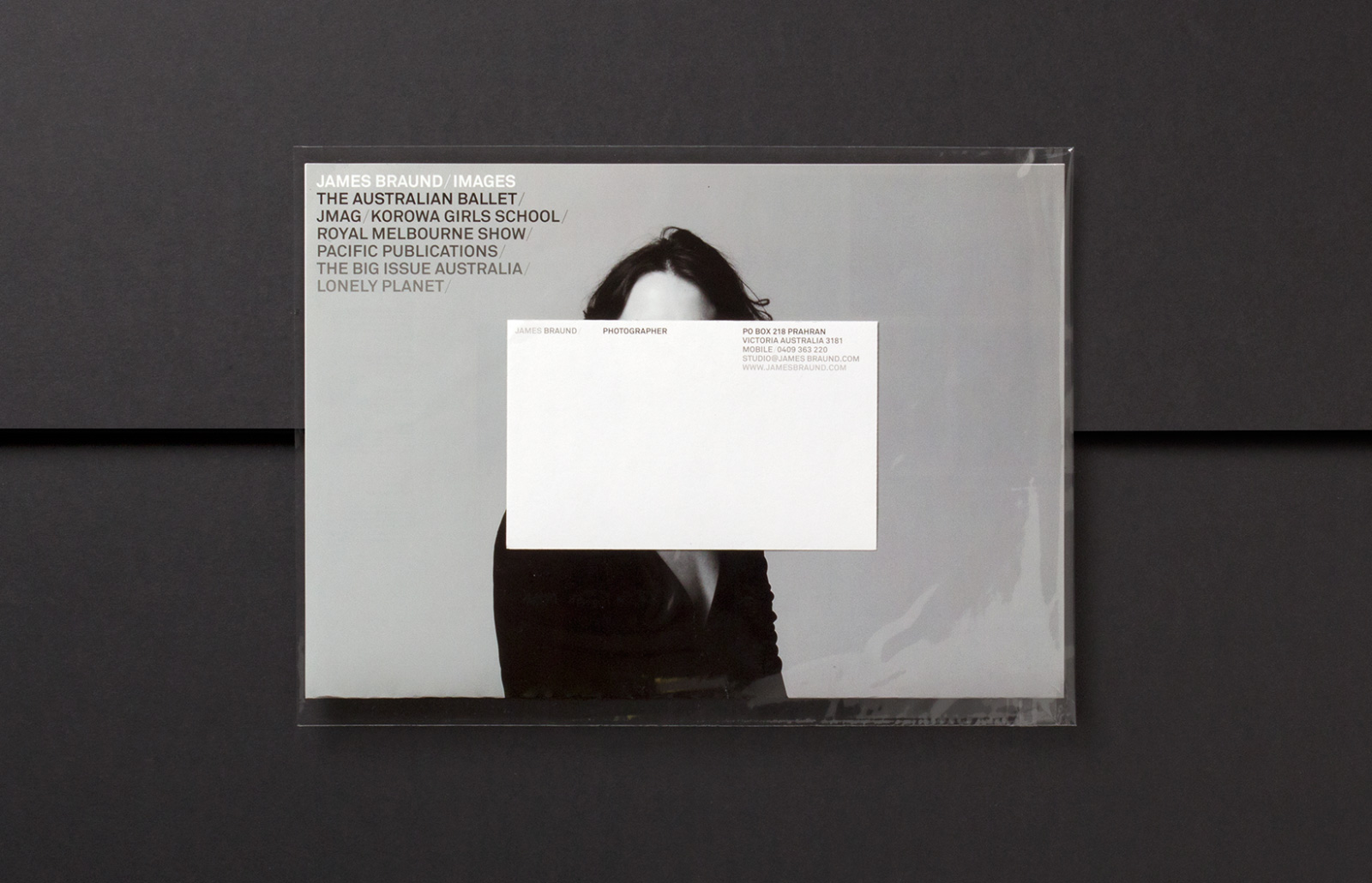
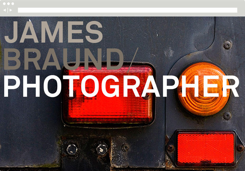
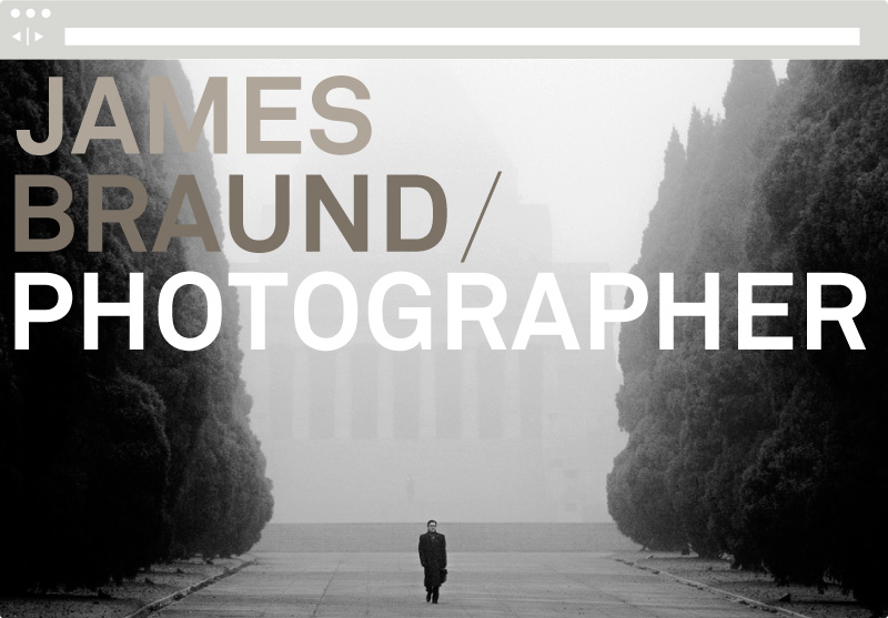
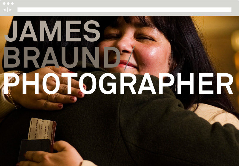
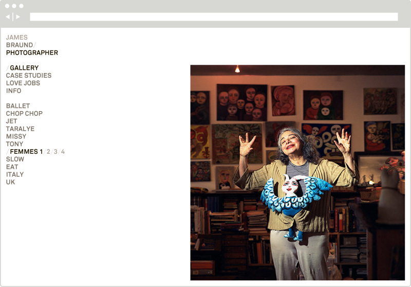
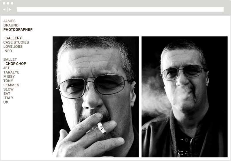
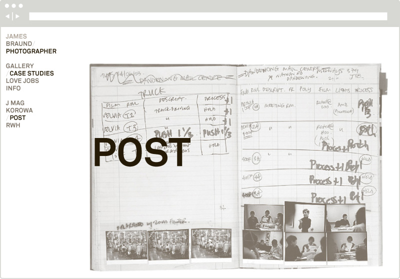
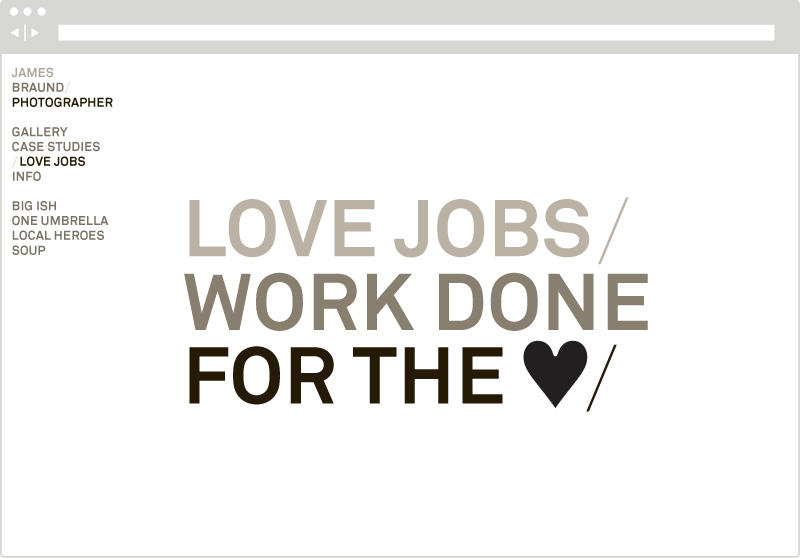
We have worked with James for a number of years on a range of corporate and non-profit work. With a background in journalism, his approach is characterised by an unfussed, direct methodology; why use ten lights when one will suffice? The opportunity to redesign his identity arose out of his desire for a more contemporary look aimed at designers and art directors.
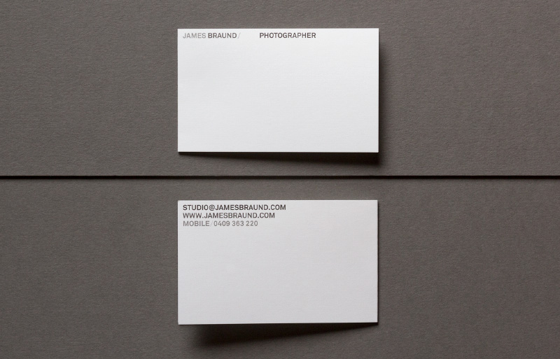
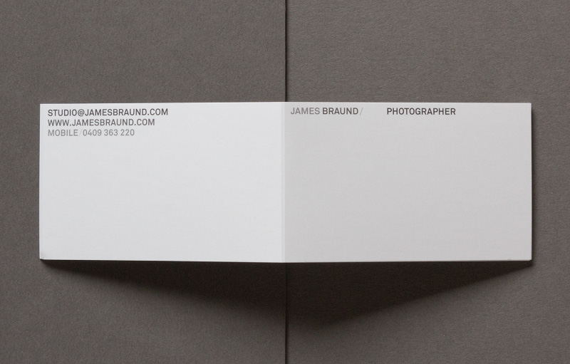
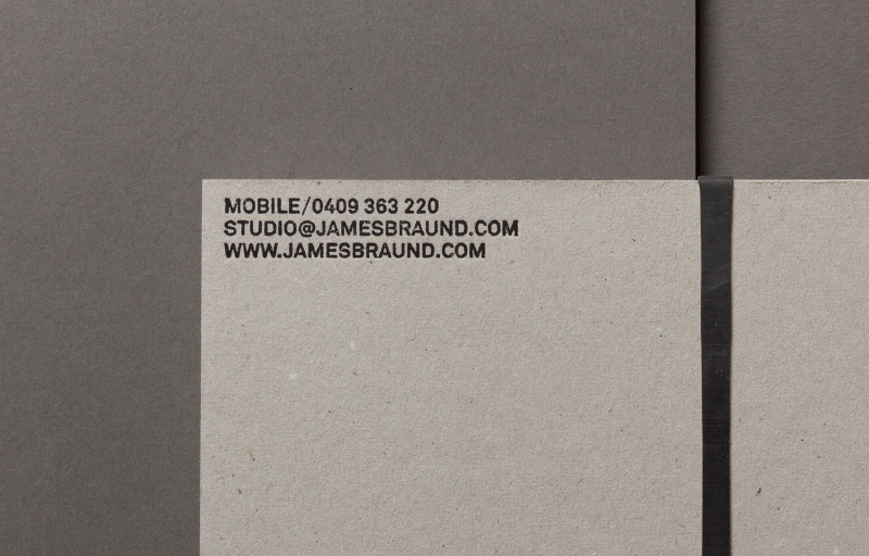
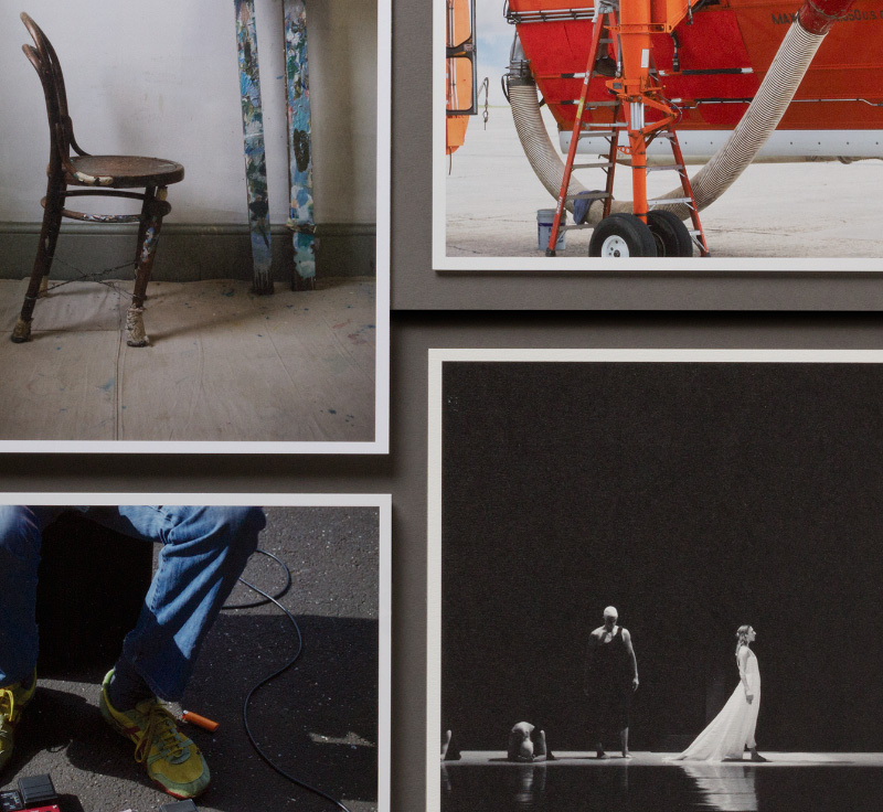
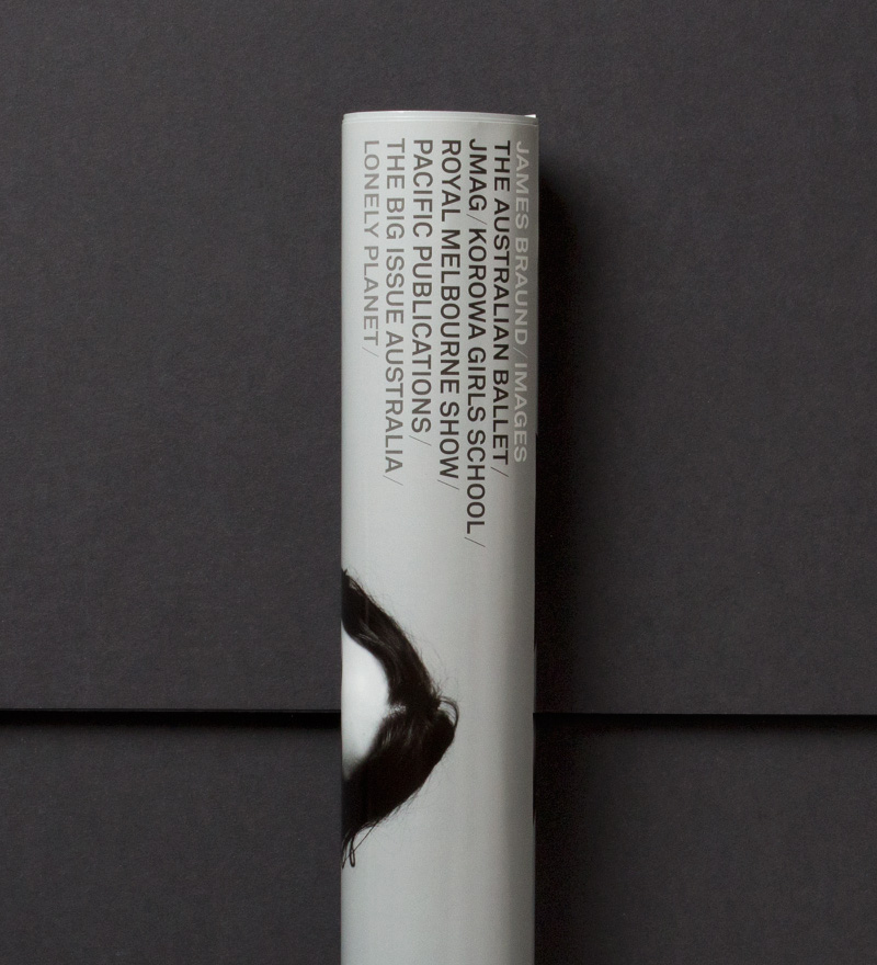
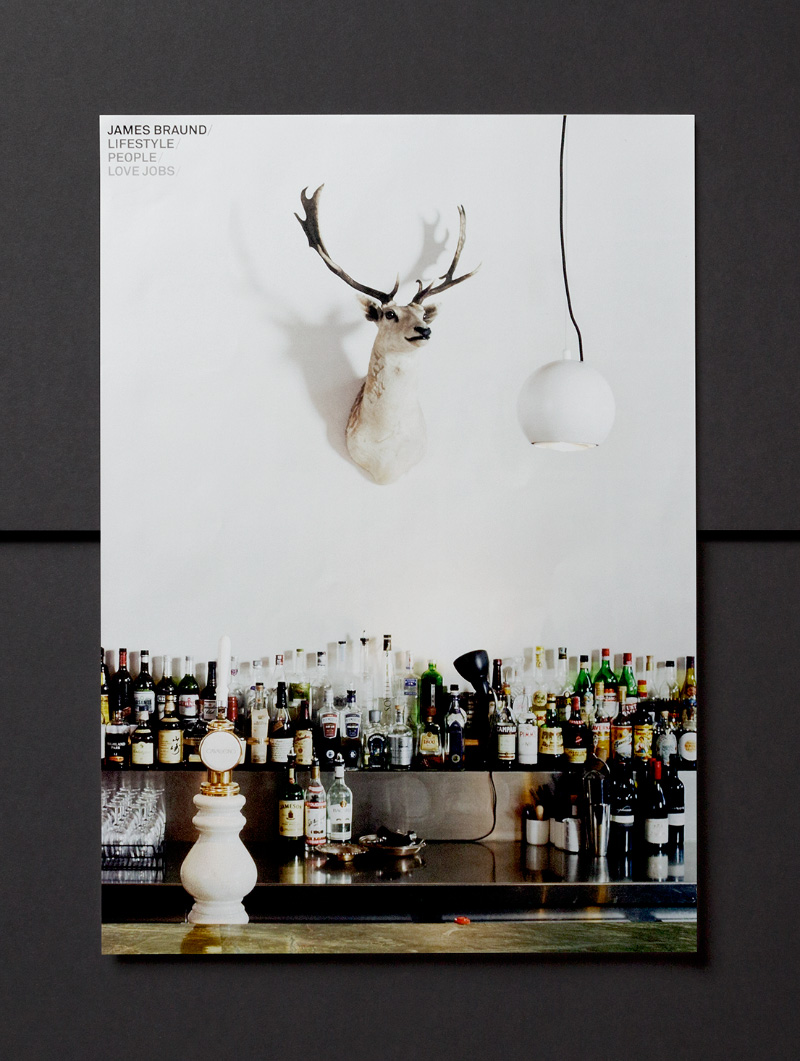
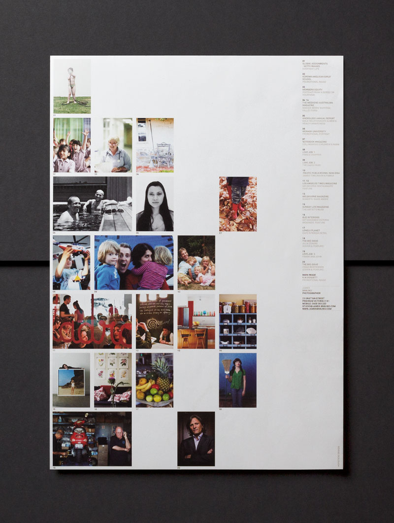
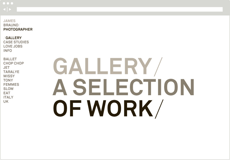
A neutral colour palette and clean, robust typography are the cornerstones of a subtle, elegant identity where James’ work is the main focus. Carefully selected paperstocks and innovative formats are also key components in a system which is both pragmatic and expressive.
